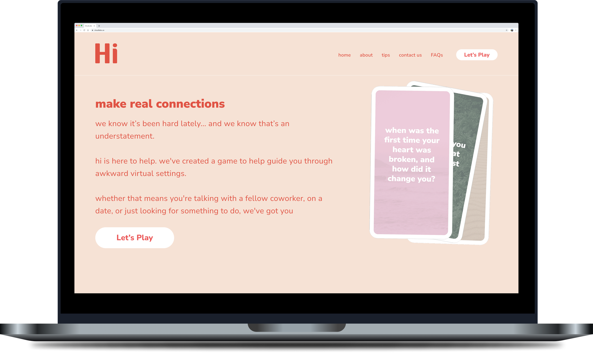
Online Get-to-know-ya Game
Ideated, iterated, coded, and launched an interactive online question generator to get hands-on experience with UX Design and front-end development.
-
3 week design course sprint:
5 UX Designers + Researchers, dabbling in front-end development
-
Interactive website, programmed from the ground up using HTML, CSS, and JS
-
The self-service COVID-19 calculator reduced the need for epidemiologists and contact tracers to conduct personal outreach to verify COVID-positive individuals knew how to stop the spread. It also mitigated confusion around how to stay safely at home, for how long, and provided personalized links to necessary support resources, such as time off from work.
-
UX Research + Design; One of TWO front-end developers
The Challenge
Meeting people in a professional social, or romantic setting, is difficult to get to know someone past formalities. Unfortunately insecurities of self image and time constraints of scheduled meetings are arising in a digital world. How might we help people connect in these virtual conversations at a deeper level?
User Research
We sent a survey out through various social media platforms, asking networks how people were feeling in virtual-heavy situations. With over 60 responses, we learned that 70% of participants didn’t feel that comfortable connecting online during the pandemic - with conversations feeling forced and zoom fatigue taking over meetings, leaving little room for friendly connecting.
65% of respondents were between 18-25 years old, 28% were single, 55% were employed, and 54% were meeting people virtually.
Interviews
We talked with 9 people, ironically all remotely… We asked in more depth about what virtual interactions looked like, what settings people were in, and how people adapted to these new norms. We also tried to gauge areas of discomfort and areas of opportunity to set people at ease in both social and work settings.
Like the survey, we found that everyone was feeling zoom fatigue and insecurity from staring at themselves, the screen, and the clock ALL day.
Ideating
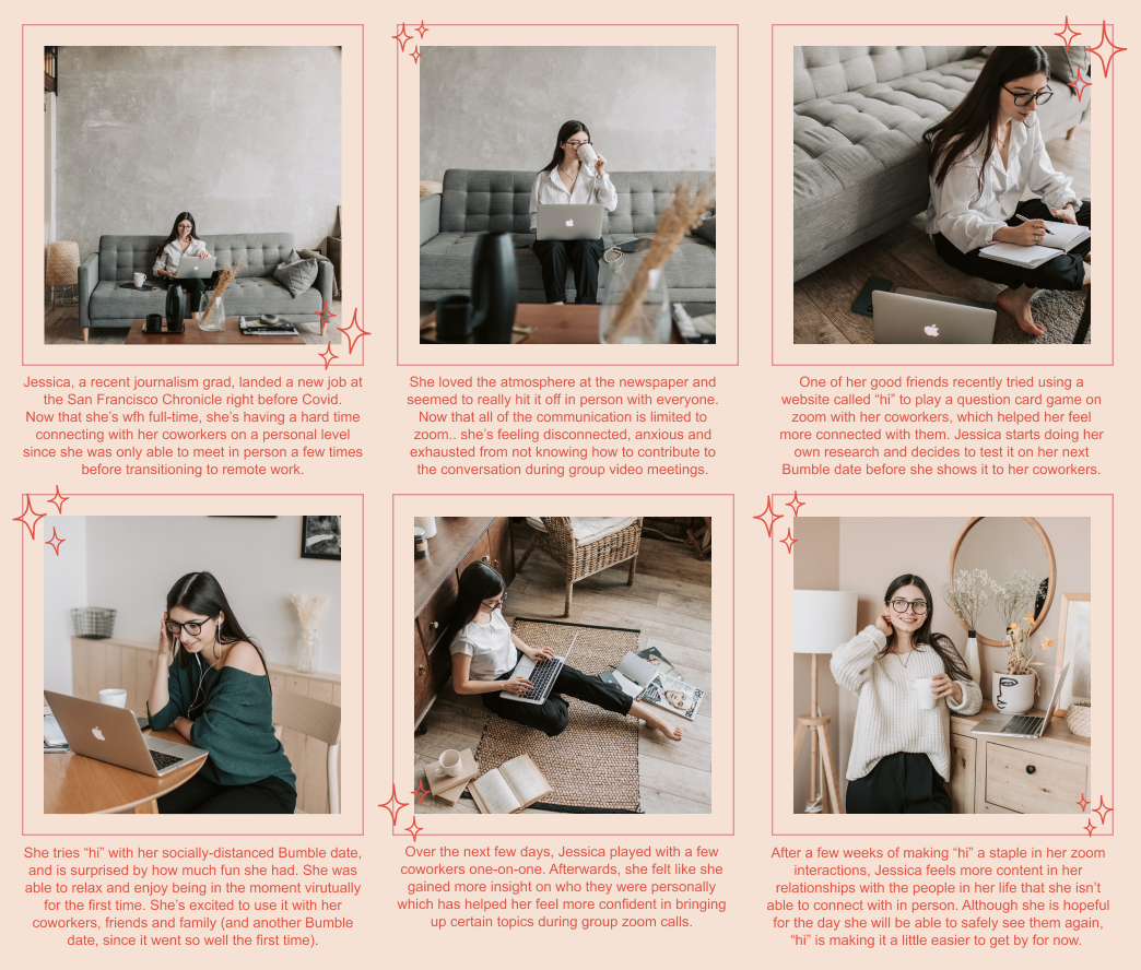
With someone like Jessica in mind, we wanted to focus on the awkward part of online connections. In one design session we threw some spaghetti at the wall, coming up with ideas including:
Online waiting rooms before meetings, where people would complete challenges or play games together to blow off some steam
Personalized theme songs before meetings
Random question generator
Pet show / virtual dog show
We decided to pursue something along the lines of an online question generator… brainstorming the idea of “Hi, Here for You”!
We wanted to build 4 key ideas within the live site:
Prompts: giving users set questions or conversation starters
Check-in feature: asking users how they feel before starting
Self input questions: allowing users to make up their own questions
Informational: help people understand what the problem is and ways to help it
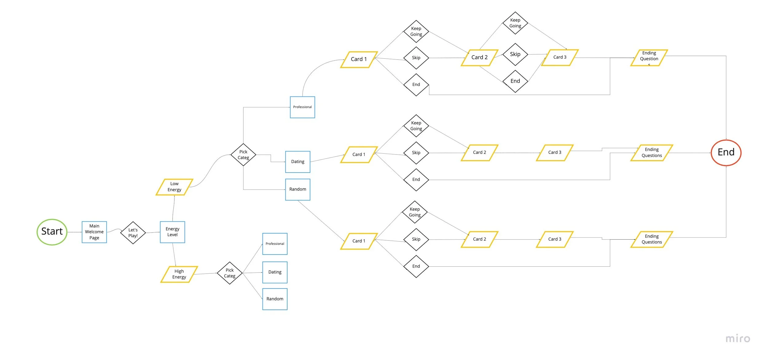
User Flow
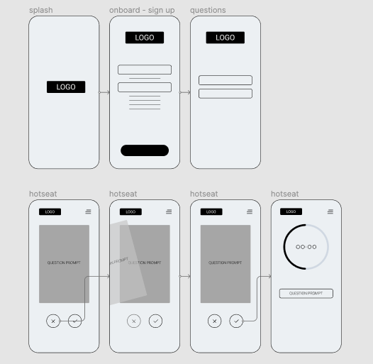
Low-Fidelity Wireframes
Lo-Fi Testing
We focused on the building out the main portions of the game:
Welcoming users
Allow them to select a category (dating, work-friendly, friends)
Play a handful of questions
It was time to see what people thought about the general idea of the game.
Results:
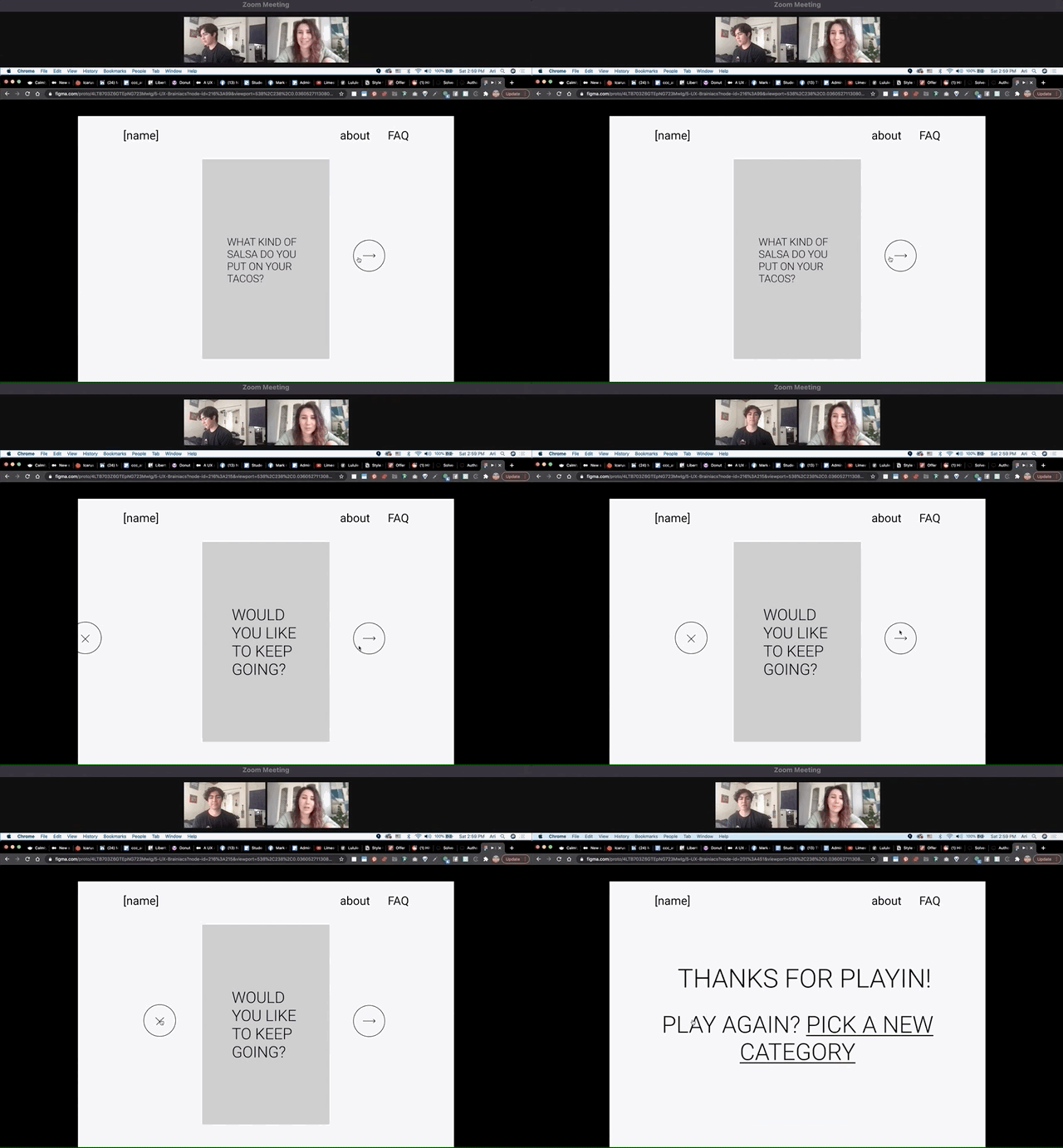
Skip button was redundant / confusing
Onboarding was wordy and unnecessary, with all participants wanting to skip
People tended to prefer lighter questions to start, working their way up to deeper questions
With this, we edited the flow and quickly jumped into incorporating visual design!
Higher Fidelity Testing
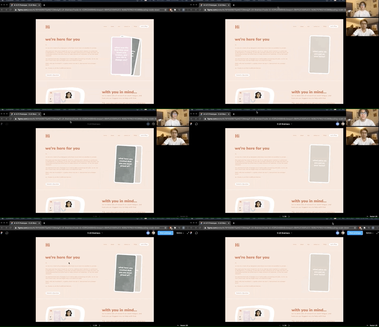
For this last round of user testing we were looking for any final iterations to make before handing the final prototype off to the development stage. We had users run through the original 3 tasks that we asked during the lo fi tests to keep consistency.
Key changes: The top navigation was too small and the hover states were not noticeable, so we changed the hovers to a clean underline and enlarged the type. Lastly the “next" button was confusing, where 1 user thought to click the card to see the next question instead of the large arrow next to it. So we added the words “next card” and made the graphic larger.
Front-End Development
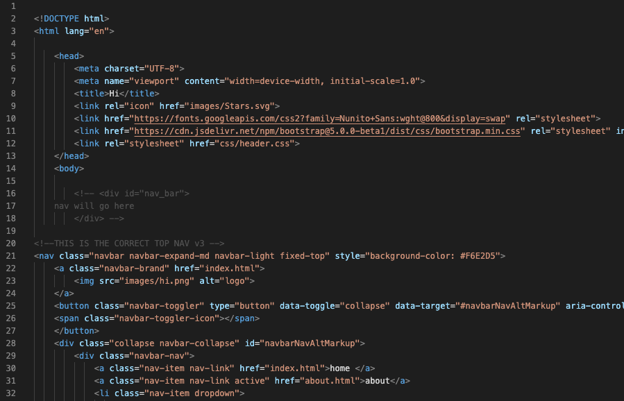
One team member and I threw ourselves into VScode, building the site up COMPLETELY FROM SCRATCH!
We leveraged HTML/CSS for the bones of the site, Bootstrap for quick design element implementation and jQuery/JavaScript for some of the interactions. This was HARD and took countless iterations, debugging sessions, youtube tutorials, consultations with professional developers (shout-out to my dad), and a bit of tears to churn this live site out with minimal quirks and bugs.
We also added in a cheeky, secret note about this entire site being coded by two females that we didn’t Include in the figma prototypes ;)
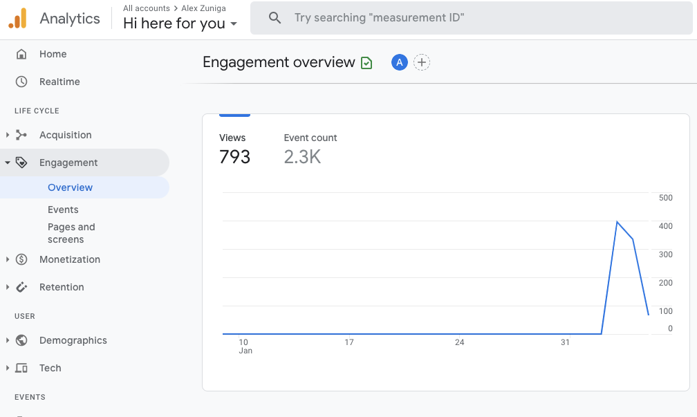
To view the live site, visit hihereforyou.com!
Though this was just for a class project, I will forever look back on this project and feel so much pride. I learned so much about myself and my interests as a budding designer, dug in and strengthened my growth mindset to code a complex idea and bring it to live, and tackled an idea that was so close to my heart during such a strange time. I hope you take a look at the game, and maybe play a round or two!

