Launching COVID-19 Response Tool
In collaboration with the California Department of Public Health, we designed and launched a self-service digital tool that simplified COVID-19 guidance into clear, personalized isolation timelines. By transforming medical protocols into an accessible, interactive experience, we significantly reduced strain on contact tracers, accelerated public understanding, and empowered thousands of Californians to take informed action, helping to mitigate the spread of the virus.
Team Structure
Lead UX Designer (me)
Software Lead
Developers
Process
Competitive Analysis
Visual and Interaction Design
Cross-Functional Handoffs

Problem
During COVID-19 surges, California’s contact tracers were overwhelmed by the volume of people seeking guidance after testing positive. Confusion around isolation protocols and limited access to resources left many anxious and unsupported. Meanwhile, the existing tools CDPH released—phone-based contact tracing and FAQ bots—were high-effort, inconsistent, and losing users fast (50% drop-off rate).
The client needed a scalable solution to deliver clear, accessible information and reduce the burden on contact tracers.
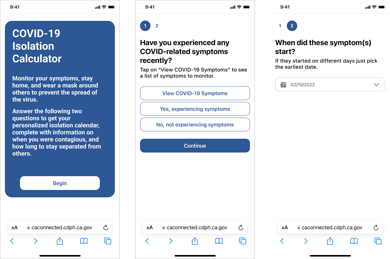
What we delivered
A self-service COVID-19 isolation and quarantine calculator, transforming a dense, manual contact tracing experience into an interactive, visual timeline that helped users understand exactly:
What to do after exposure or testing positive
When to isolate or quarantine
How long to stay home, with personalized medical guidance
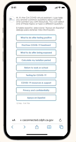
We embedded this tool into the existing CDPH Virtual Assistant, making it fast to deploy while reaching users at key moments of concern (test results, exposure notices).
With a streamlined, user-tested flow that delivered personalized guidance in minutes, this tool addressed a critical gap in COVID-19 response. It reduced reliance on overwhelmed contact tracers and empowered users to take informed action—here’s how:
Reduced contract workload
By transforming a manual, script-based process into a guided self-service tool, we significantly reduced the number of calls and time contact tracers spent explaining isolation protocols—freeing them to focus on high-priority outreach.
Reached millions of Californians
The conditional logic and visual calendar helped users cut through confusion, understand their next steps, and access support faster—leading to safer behaviors and increased trust in the state’s COVID-19 guidance (plus COVID-19 containment).
Ideation
We knew we wanted to steal the visual element of the calendar from the contact tracers’ backend portals. This allowed contact tracers to visually see people’s personalized exposure period (how long they were probably sick), the infectious period (how long they could spread the virus), and how long to stay at home (isolation and quarantine timelines). We wanted all of that, but in a
public-facing tool.

Research and Defining the flow
We mapped out user journeys by working backward from the most critical questions:
Did the user come in contact with someone COVID-positive?
Did they feel sick, and how to define "sick" to people?
Had they taken a test, and if so, was "positive"? Did they take one too soon and received a false-negative? When did they take a test? Have they maybe not thought to take one?
Did they have symptoms? Which ones? Were they asymptomatic?
How do we account for the changing medical guidance?
We collaborated with epidemiologists to ensure the logic matched the most current CDC and CDPH guidelines.
Competitor analysis
I explored multiple, free-to-the-public tools that offered what we were looking to build. Most had a simple flow:
Input symptom start date or if they were exposed to a COVID-19 positive person (this would define isolation vs. quarantine which had differing stay-at-home guidelines)
When did you take a test.
This would allow the tool to calculate the specific dates that the person should stay away from others, and wear a mask.
These tools were all text-based, without any supporting visual aids to help understand the complex information. With the guidelines at the time, isolation could end within 5 days, so long as the person did not have a fever (without the use of medicine) and had no symptoms; or, isolation could continue for 9 days if the person just had a sniffle. We worried that these specific rules would get lost without a more clear delivery system.
Wireframing
Played around with a web implementation, with the tool asking questions in a large question-by-question approach.

Played around with a web implementation, with the tool asking questions in a large question-by-question approach.
Implementation
The final tool was embedded into the existing CDPH Virtual Assistant, a platform already familiar to users who sought COVID-related guidance. This integration allowed us to deploy the tool quickly and efficiently, reaching users when they needed it most. By keeping the process within the virtual assistant, we avoided disrupting the user’s experience while ensuring that the self-service tool was readily available.

Final screens
After iterating, we realized we didn’t need to ask about which symptoms they were experiencing and could instead provide a comprehensive list on symptoms.
With us landing on including the tool within an existing CDPH tool, creating the designs were smooth sailing from there.

Takeaways
Working as the lead product designer on this project, I was able to navigate an incredibly fast-paced, high-stakes environment, collaborating with a cross-functional team to create a solution that was both scalable and user-centric. Through rapid iteration and constant feedback from our client, we were able to launch a tool that not only solved a critical problem during the pandemic but also set a precedent for future public health initiatives.
The result wasn’t just a tool—it was a lifeline for thousands of Californians who were seeking clarity in a time of confusion. By making the process of isolation and quarantine more accessible, we played a small but meaningful role in supporting public health efforts and helping slow the spread of COVID-19.