Building Zerigo Patient-Facing App
Zerigo Health contracted a small design team to transform its mobile app for patients managing chronic skin conditions. By overhauling the app’s information architecture structure, visual design branding, and introducing new confidence-building features, we supported 20% higher treatment adherence and elevated the platform’s overall clarity and trustworthiness.

Team Structure
Business SVP
Head of Development
Software PM
2 Designers
Process
Usability Testing + Eval Research
Information Architecture
Visual Design
App/Product Development
High-Fidelity Prototyping
Problem
Zerigo Health offers light-therapy for chronic skin conditions. Patients are given a portable device, a care guide, and an app to understand and track their path to remission.
The app equips patients with tools to manage chronic skin conditions—yet the experience of using the app didn’t match the quality of the care it aimed to support. Despite having a functioning product, the app’s usability issues stood in the way of meaningful, confident engagement.
What we delivered
We redesigned Zerigo’s core experience, while fleshing out new components, to eliminate confusion, speed up time to complete tasks, and rebuild patient trust.
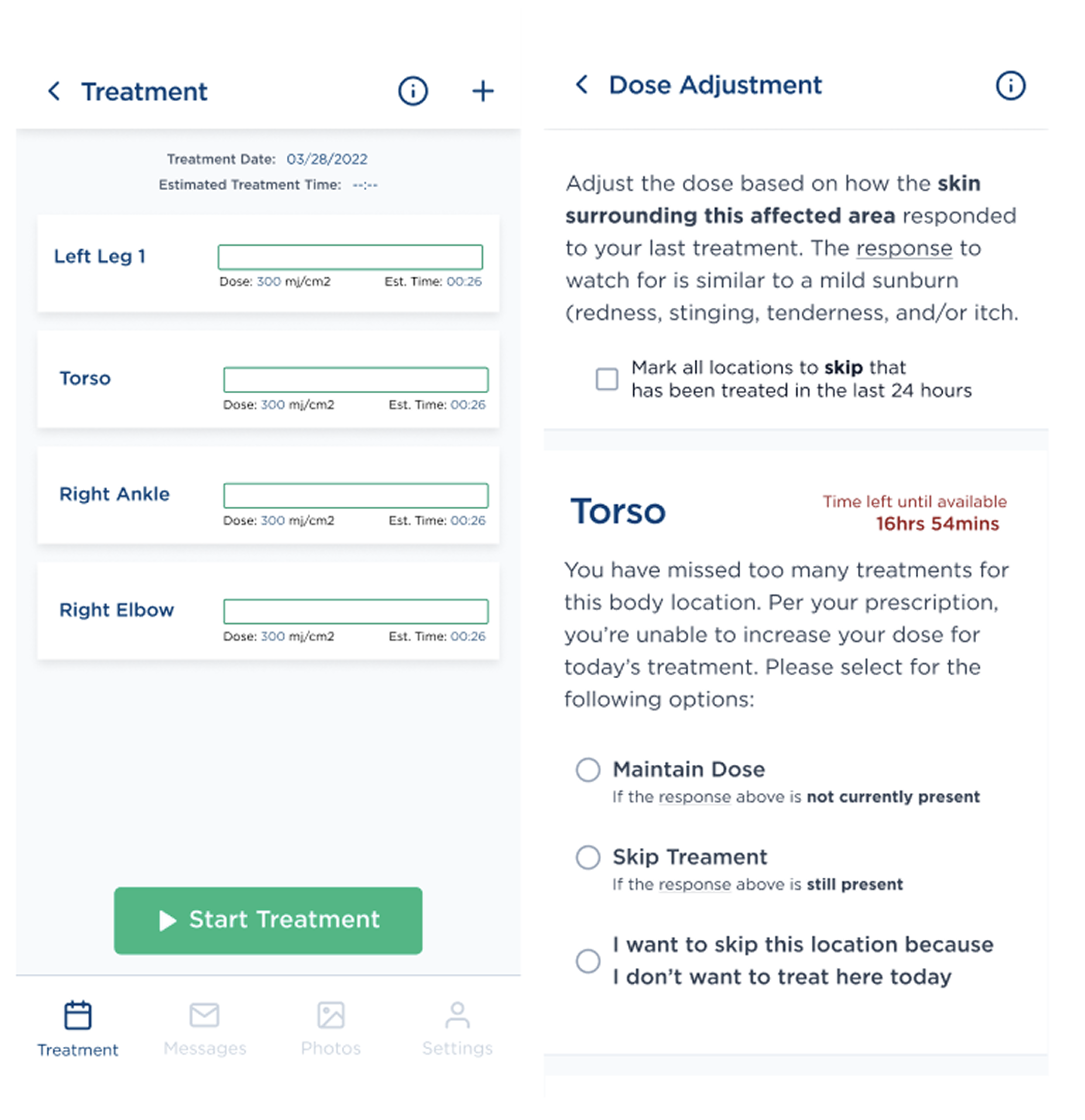
Removing guesswork from dosages
We distilled complex medical guidance into clear, actionable steps—so patients didn’t have to “figure it out” themselves. Reduced overall number of clicks on progress updates and treatment, helping patients want to log this information.
Visualizing progress for higher confidence
Adding in a dedicated photo portal allowed users ability to actually compare and notice slow progress. They could see when and why images were needed—building trust instead of skipping out on this crucial offer.
Smarter data, better predictions
Visual depictions and standardized naming conventions replaced overwhelming lists when adding body locations to reduce decision fatigue and bad data that helped inform personalized remission timelines.
Simplified flows = higher engagement
By streamlining the entire app, we made it faster and more intuitive, helping users spend less time navigating and more time focusing on their treatment. The simplified interface allowed patients to engage with their care in a way that felt seamless and stress-free.
Research
Conducting evaluative and usability research identify key changes for a more functional app.
Why redesign?
Though the company had already developed a working app, users faced significant challenges in navigating the interface and accessing key features effectively. The app lacked clarity, inclusivity, and accessibility, which ultimately affected its value and usability for a wide range of users. These gaps in design, including unreliable data logging, complex navigation, and unclear language, were undermining the app’s potential to meet user needs.
Progress check UI issues
Users don’t understand what the emoji check-in means
Inconsistent naming conventions, hard to keep track of where they are and what they mean
What do the likert tags mean? Define severe vs. mild
Sometimes photos are required, and other times not. How to tell? No tagging of requirements
Not all skin conditions look like the available options, unsure how to proceed without a relatable sample

Make it purposeful, respectful, and clear
Every interaction should feel essential—not like a hurdle. Patients come to treat, not to troubleshoot. Progress checks must be quick, clearly explained, and respectful of their time, privacy, and intelligence. If users don’t see the value, they’ll skip the flow. If they don’t understand it, they’ll drop off. We owe them clarity, control, and a sense that every step moves them closer to remission.
“
I truly dislike your ‘progress checks’ and particularly my most recent which required a photo. I have a physician and really shouldn’t be subject to that type of privacy invasion. I would like to decline all other ‘added services’ and troublesome invasions.
Dose adjustment UI issues
Users admitted to skipping this chunk of text
Users hesitated on what to do here; why click on what they needed to change?
What is the prescribed initial dose? Why does the user have to select this information themselves-- isn’t this dangerous?
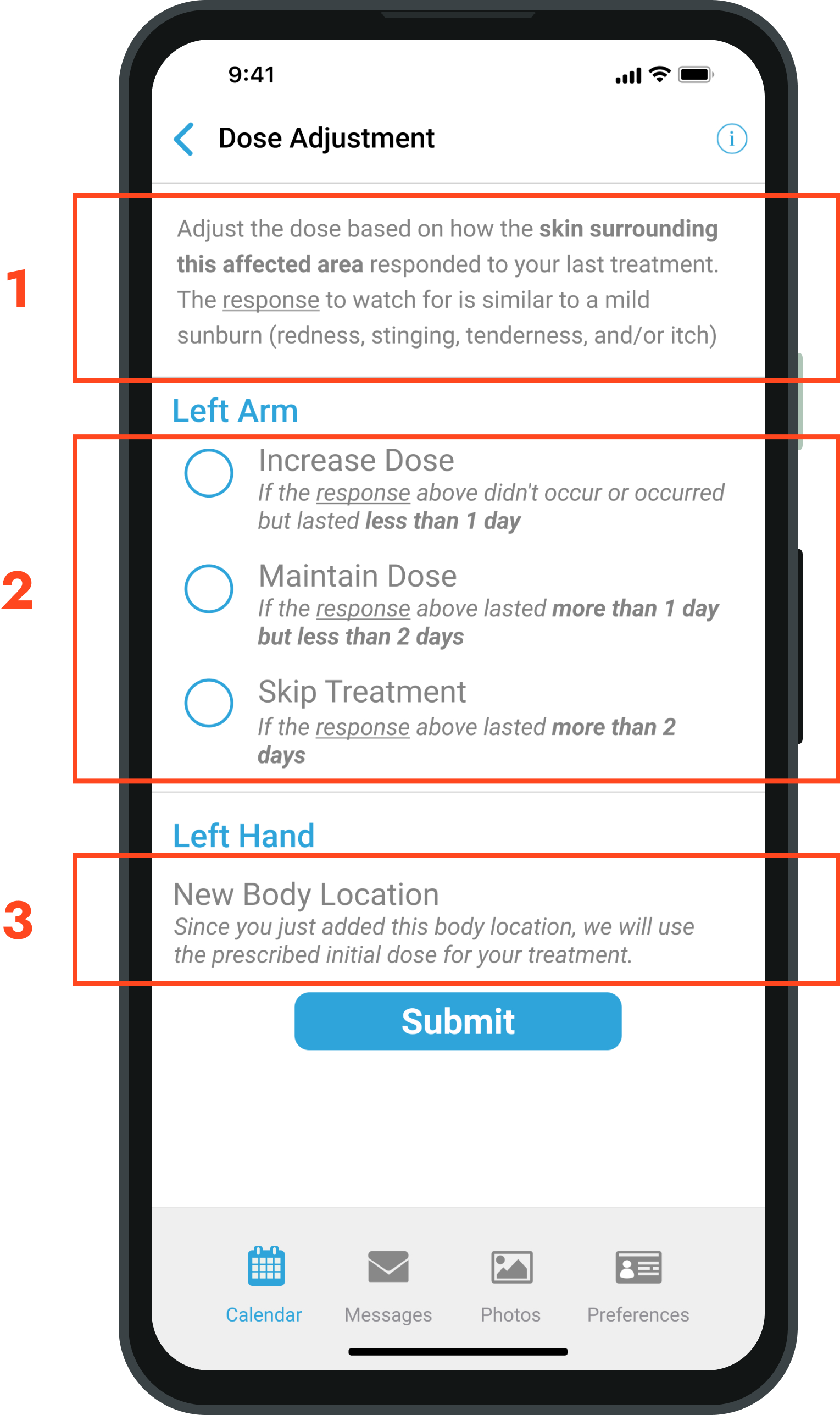
Remove all guesswork
Patients should never have to interpret or decide their own treatment path. The app should act as a trusted extension of their care—not shift clinical decisions onto them. Clear, confident guidance for each body part, without overwhelming instructions or choices, is essential. Every step should feel safe, supported, and personalized—so users can focus on healing, not second-guessing.
“
How am I supposed to proceed from here? I don’t know if I should increase or maintain or skip because I don’t remember from my last symptom check-in? This is my problem.
Treatment flow UI issues
Improper padding, inconsistent styling
Newer users weren’t sure what to click and what to do based on the display
Start treatment of what body area?

Easily treat and add
body locations
New users should never feel lost or unsure of what to do next. Each step must clearly guide them without confusion or ambiguity. By simplifying buttons and making choices easy to understand, we ensure users can move through the flow with confidence and clarity. Every interaction should be self-explanatory, removing any need for users to second-guess their actions.
“
I generally treat at the end of my day, I just want start treating with least amount of effort possible. Sometimes it will take me more than an hour to do my treatments and requiring me to do more is a burden.
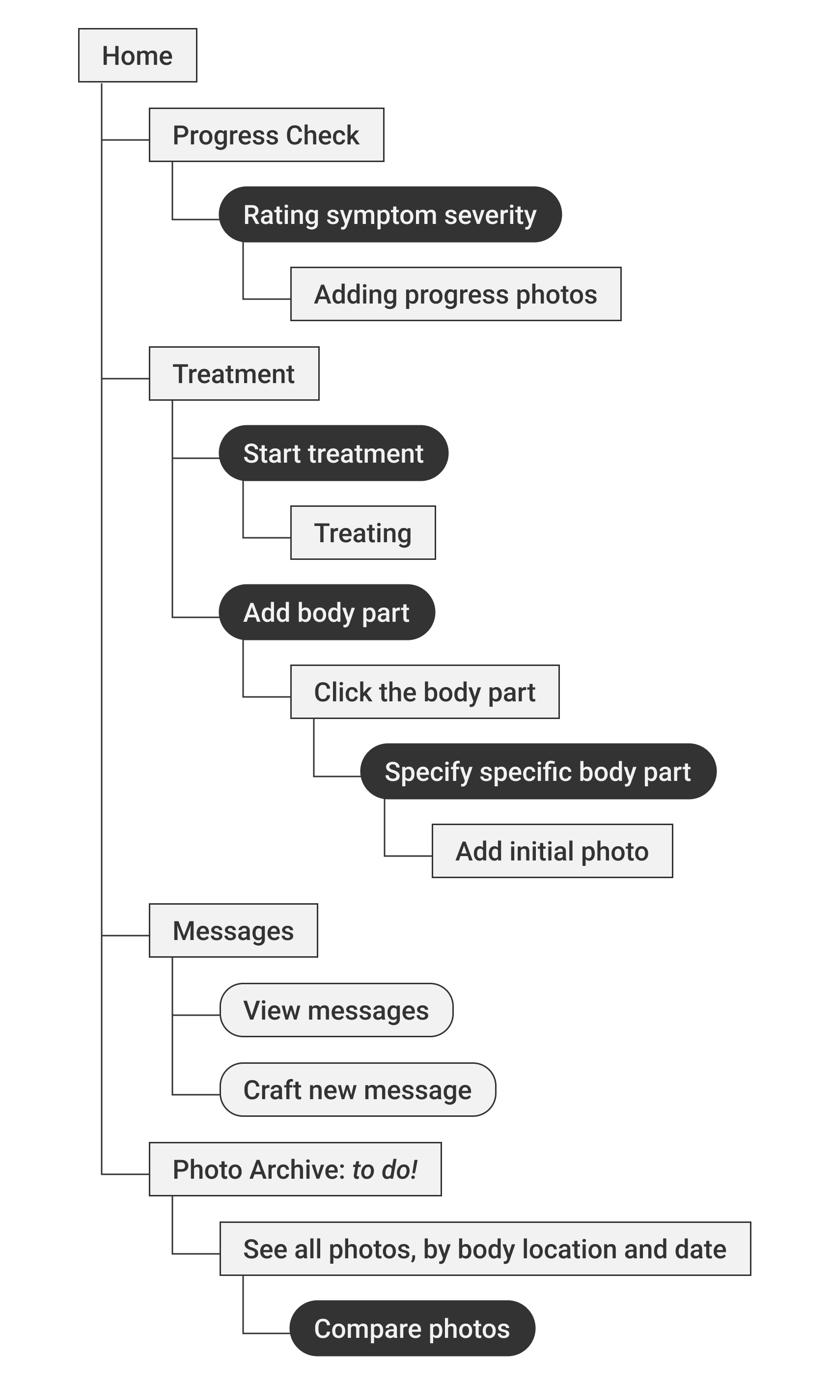
Design Iteration
With a tight budget and tight timeline, we jumped right into visual design and iterating on concepts for the entire app, focusing with the key features.
App at a glance
With four main features, key tasks were buried. Here is the streamlined version of the app we created.
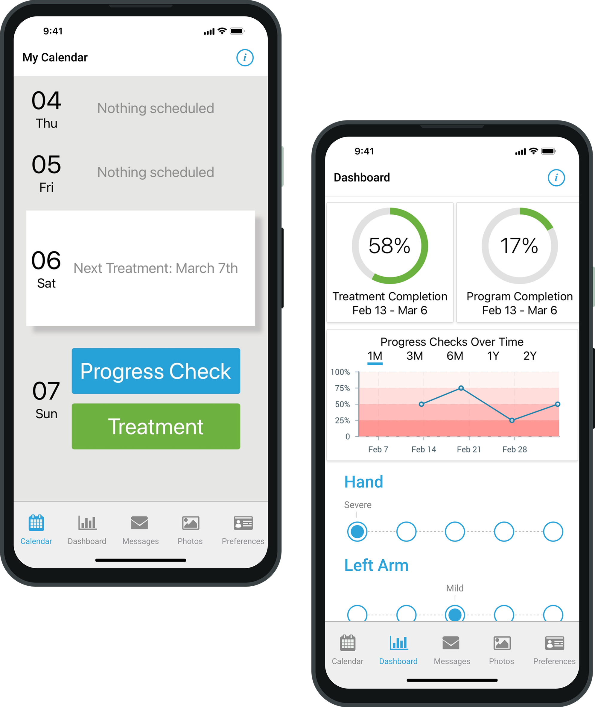
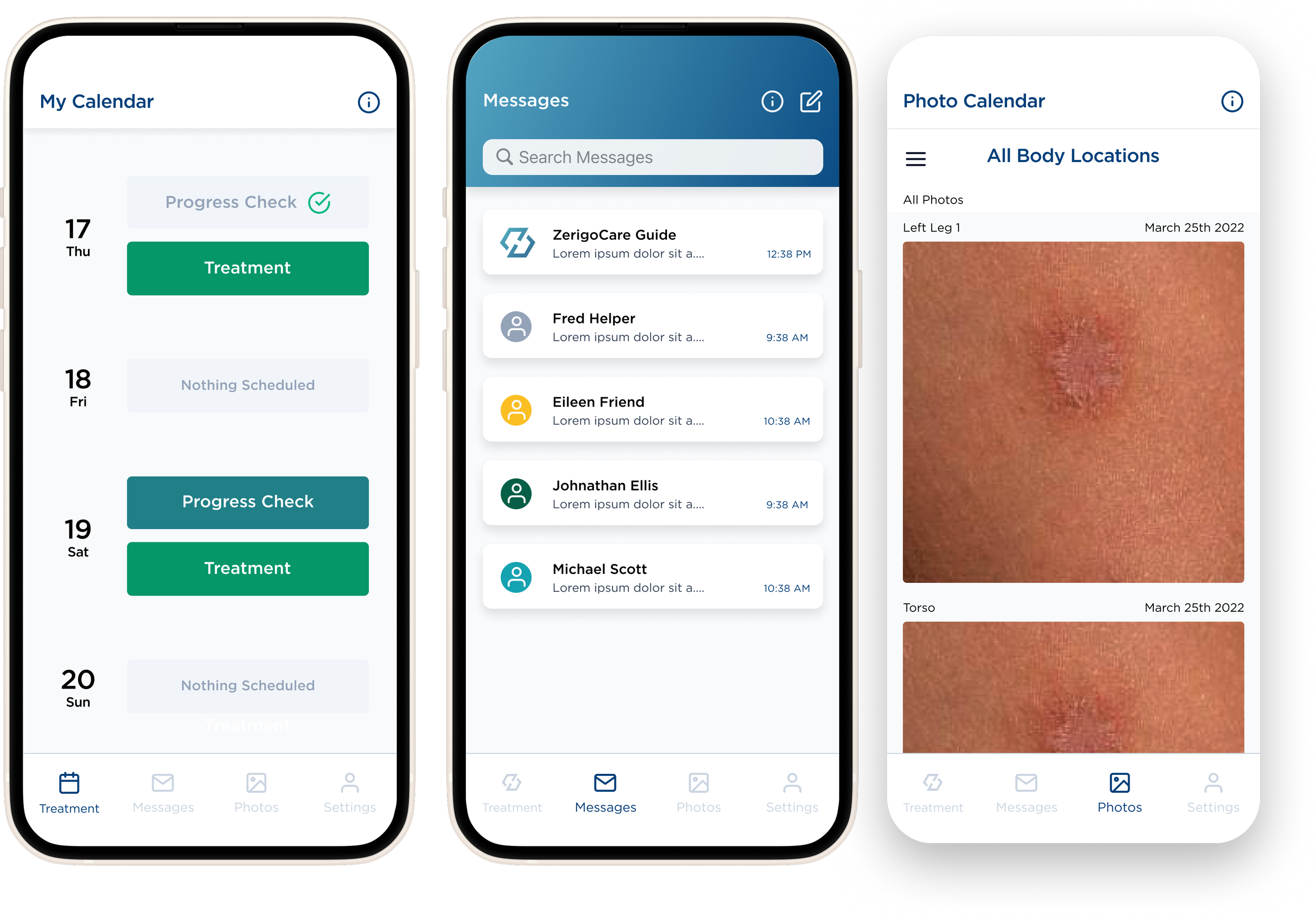
Progress check
Intended to rate symptom severity and add progress photos to help inform treatment doses (or if treatment was even safe this session).
Message center
Allows patients to interact with their care team to ask questions and adjust treatment schedules and timelines as needed.
Treatment logigng
Patients can identify body parts that have a skin condition they want to treat, and then visit this feature when it comes time to treat to know the dose and how long to use the device.
Photo archive (not built yet)
This was not operational at the time we were contracted, but intended to help users visualize their progress and compare where they are on one day vs. another.
Homepage iterations
Adding a body location

Treatment and dose adjustment
Final screens
The final screens for developer handoff.
Key screens
Progress check

Adding body part

Treating body part

Impact & Takeaway
How our redesigns impacted users, the business, and what I learned.
Impact
20% increase in treatment adherence
By simplifying daily check-ins and removing unnecessary steps, we turned logging into a quick, repeatable habit that patients could sustain.
Frictionless check-in
We streamlined the check-in and treatment process by reducing clicks and adding skip options, making it easier for patients stay engaged and finish treatment.
Smarter, safer inputs
By standardizing body part inputs (avoiding nicknames), we streamlined the data collection process, enabling Zerigo engineers to more accurately predict remission timelines.
Challenges
Fighting for basic UX
Business stakeholders are... business stakeholders! Ideally more rounds of usability testing, research, and iterations to make a more robust app.
Streamlining everything
Having to distill medical information into clear, concise instructions. Still a work in progress when we wrapped, to make sure everything was safe.
Strict timelines
With the business stakeholders wanting to ship features quickly, we weren’t able to iterate and refine designs (or test) as much as we intended.
Takeaways
Zerigo was my first design job, and it shaped so much of how I approach projects now. I learned how much a solid information structure and clear, thoughtful visuals can actually build trust—especially when you’re asking someone to stick with a long-term health plan. It was my first deep dive into balancing business, medical, and user demands… and it made me fall in love with solving messy problems through design that feels calm, human, and confident.